RSS
Facebook
Twitter

Showing posts with label Wealth inequality. Show all posts

Saturday, November 5, 2011

Recently, I created a boring graph tracing the federal tax burden over a 15 year period by income quintile. The story has been and will likely continue to be steady as she goes. There are no intended polemical points in that post or in this one--they're just outgrowths of my ignorance and curiosity.

The following table shows the share of federal tax burden as a percentage of total money income (defined here, a couple of pages down) by quintile in 2010. The bottom quintile, for example, pays 1.1% of all federal taxes and 'earns' 3.3% of total income, for a tax-share-as-a-percentage-of-income-share of 33.3%:

Quintile
Tax:Income
Bottom
33.3%
Second
60.0%
Third
70.5%
Fourth
82.1%
Top
127.7%

Tax planning aside, the federal income tax is still clearly an extremely progressive one in absolute monetary terms. For it to be regressive, the ordering by income quintile would have to be exactly reversed, which would require a seismic shifting in the current tax code that is almost unimaginable. Even a truly "flat tax", where tax burdens and income shares are perfectly aligned, is contemporarily unthinkable.
Monday, September 26, 2011

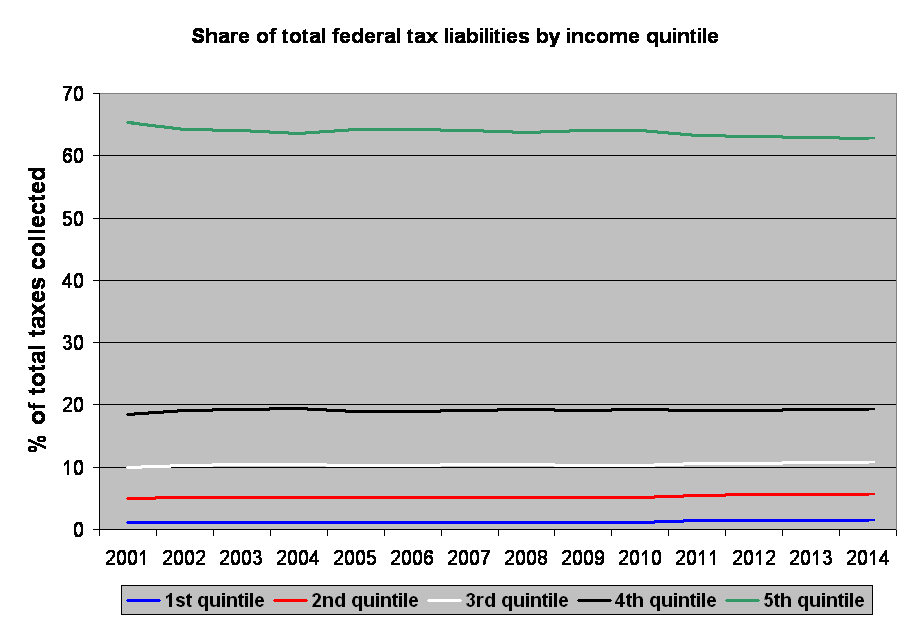
In a post where he presents a table from the CBO showing the share of federal tax liabilities by income quintile in the US from the beginning of the 21st century to a few years into the future, Randall Parker points out how much taxes would have to increase on the top 20% of income earners to close the 2012 federal deficit:
How much would taxes have to increase on the top 20% to balance the budget? For 2012 the projection is for $2.627 trillion total revenue, $3.729 trillion total expenditures, and $1.01 trillion deficit (and I think it will be worse than that due to Peak Oil Recession II). Well, if the top 20% really pay 63.1% of total federal taxes (see table above 2012 column) then they are paying 0.631*$2.637 trillion or $1.66 trillion. Their total taxes paid would have to rise about 66% in order to close the federal budget deficit.
Making the same calculation for the other 80% of the population, we find that their collective tax contributions would have to increase 104%--that is, more than double--to close the single year deficit. That, of course, wouldn't get us out of the financial hell hole (of debt) the country is in, it would just mean we'd momentarily set the shovel down. And, in actuality, such enormous increases in tax liabilities would lead to shrinkage in the private sector, lower incomes, and thus a smaller economic base to tax from.

Randall also comments on how little the tax burden has shifted by income over a decade and a half. Even more apparent than the table he presents makes it, the following graph shows the stasis:


So, the top 20% does most of the vast majority of the heavy lifting. Those in the second quintile from the top, in the 60%-80% range, pull their own weight, and the bottom 60% are dragged along by those earning more than they do.

Saturday, September 10, 2011

Diversity is Strength! It's also ... inequality

I'll justify ripping off VDare's recurrent article naming theme by segueing into congratulating the site for getting a much needed aesthetic makeover, and I'll even do so upon discovering that this humble blog has apparently been dropped from VDare's roll as, I hope, an incidental consequence of the revamp. Anyway, I wanted to publish a few odds-and-ends correlations, so instead of cramming them all into the title, I'll just filch it.

At its essence, to celebrate diversity in the contemporary West is to celebrate the portion of the population that is non-white. Contingent upon context, it might also refer to the portion of the population that is non-heterosexual, non-Christian, non-Western European, etc. But in its most recognizable form, diversity is basically synonymous with non-whiteness.

Using that as the definition, the correlation between diversity and income inequality (as measured by the gini coefficient) at the state level in the US is .43 (p = .00).

More than that (much more than that, actually), though, diversity is also poor academic performance. The correlation between NAEP science and math test scores (that I used to estimate average state IQ numbers) and diversity is a vigorous .77 (p = .00).

Parenthetically, one of my earliest recollections of the formation of a personal partisan leaning was after my dad outlined for me the basic differences between the two major parties. I concluded something to the effect of "So, if people are happy and do well, Republicans should do well, too. If they're unhappy and struggling, Democrats should do well." Relative equality isn't sufficient for happiness, but it's probably necessary. And red states are modestly more egalitarian than blue states are--the correlation between McCain's share of the vote and inequality is an inverse .31 (p = .02).

Tuesday, August 2, 2011

On the wealth gap

Pew recently published a report accompanied by a press release that highlights the recent growth in the ratio of the median wealth of white households relative to that of black and Hispanic households. As of 2009, the median white household's net worth was 20 times that of blacks. Just four years prior, the multiple had 'only' been 11.

The median net worth of white households fell over $22k from $135k in '05 to $113k '09, while black net worth decreased $6, from $12k to $6k. White wealth decreased more than NAM wealth in absolute terms.

As nearly one-quarter of NAM households have no assets beyond a vehicle (about 1 in 17 white households are in the same situation), it's a bit misleading to focus on relative multiples, since the floor is not zero, but some undefined negative number far below that. If a double dip recession propels us into "peak everything", imagine the consequences are another $20k off of median white household net worth and another $5k off black net worth. Now we're looking at a multiple of nearly 100 between white and black wealth. Is it plausible that the relative increased suffering of blacks will be an order of magnitude worse than the pain this causes whites? If black net worth falls to $100 and white net worth to $50k, is the black situation 500 times worse? Doubtful (though it is admittedly difficult to quantify economic suffering). And what if median black wealth falls $7k, into negative territory, where a large number of blacks already are? The multiplier becomes a negative number, which just gets really confusing in the popular press.

Anyway, the underlying data that comparative reports like these are built upon is often useful for calibrating one's hazy conception of the American scene (in this case, by affluence and race) into something sharper. Unfortunately, even though the report understandably focuses on median rather than mean wealth, breaking out actual average dollar figures by asset class for all households is more tenable for mean wealth than it is for median wealth based on the figures provided. Consequently, that's what the following table displays, derived primarily from the data on page 6 of the full report (all figures are in US dollars, rounded to the nearest $100):

Asset class
Whites
Hispanics
Blacks
Asians
Total assets
271,000
73,000
73,800
313,000
Own home
103,000
40,200
41,300
109,600
Rental property
16,300
6,600
4,400
15,700
Other real estate
10,800
1,500
2,200
3,100
Stocks and mutual funds
43,400
2,200
3,700
100,200
IRA and Keogh accounts
27,100
4,400
4,400
18,800
401(k) and thrift accounts
32,500
8,000
10,300
31,300
Financial institution accounts
16,300
4,400
4,400
18,800
Other interest-earning assets
5,400
700
700
3,100
Business equity
19,000
10,200
6,600
15,700
Vehicles
8,100
3,700
3,000
6,300
Other assets
8,100
1,500
700
3,100
Unsecured liabilities
(13,500)
(9,500)
(8,900)
(12,500)

The gap between whites and NAMs is by far the widest in categories involving financial assets. While the average white family's sedan is only twice as nice as the average Hispanic's family van, the white family's Scottrade account is 20 times as valuable. Seeing people on the street gives the general impression that whites tend to be a little better off than NAMs, but it's certainly nothing like a British tourist traveling to a village in the Congo. Seeing each of these people's personal ledgers reveals that behind relatively equal public appearances, whites have a lot more tucked away than NAMs do (and Asians--whose cars are less flashy than those of whites--have even more than that tucked away). If whites and Asians tried to be as opulent relative to their real wealth as blacks (and to a lesser extent, Hispanics) do, racial tensions and the clamor for robin hood economics would be even worse than they already are.

A couple of other interesting asides: 1) The report mentions that the Asian figure for stocks and bonds is noticeably higher than it was four years ago, even though the DJIA lost around 40% of its value over that period of time, and suggests caution in putting too much stake in an Asian sample that may have had an unexpectedly high number of very affluent participants. The total mean wealth of Asian households holds over the four year period. As the recession hit states with large immigrant populations the hardest, it would be expected for mean Asian wealth to drop quite a bit, like Hispanic mean wealth did. So the caution is valid.

2) While the median Hispanic household's net worth is higher than the median black net worth, mean black net worth is higher than mean Hispanic net worth. Among the lower classes, blacks struggle a little more than Hispanics do. But there are a lot more blacks than there are Hispanics who make it big in things like sports and the world of entertainment.
ban nha mat pho ha noi bán nhà mặt phố hà nội